This week's Sunday Run-down post will feature 5 of my favourite typographers past and present. I like to use these posts as a reminder of past artists I have researched and ones to remember for the future, it also gives me a sense of encouragement and a hit of inspiration.
I love his use of mix-match style of papers and tones combined with his hand drawn lettering and scribbles. The sketchy, expressive marks overlaid to his collages help draw all elements together.
My work influenced by his design in a past project of mine from a-level
Her work features very witty and quirky jokes along with retro, vintage imagery. Her concept deals with domestic stereotypes viewed through the advertisements of women's magazines. Her very tongue-in-cheek commentary on the imagery of housewives from the 50's and 60's are her signature work.
My work inspired by her work also from a past project at a-level
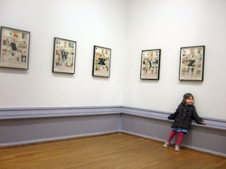
I had the pleasure to attend his exhibition of his alphabet a few years ago, whilst he was there viewing it himself! His series of work reminds me a little of the alphabet I have been designing, this could be a nice way of collecting some research and representing significant letters such as initials.
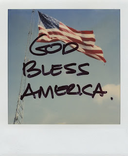
Her work is so poetic and personal, I love how she creates the story behind the photo by documenting her memories, thoughts and feelings.
I was so inspired by the polaroid effect of her photography that I chose to translate a selection of my photos I took as a primary source for my book cover module 147 DVA Design in Context.
A very similar style to Eduardo Recife with the use of photo collage, materials and hand drawn text/drawings. I love the tonal range they both use to create that vintage loved feel.
NAP x


No comments:
Post a Comment