Search This Blog

Thursday 21 March 2013

A mature (cheddar) film


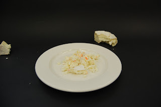
As promised here's a little snapshot into the filming of our video inspired by PES and the site plate interactive. We wanted to showcase are 4 main topics which we have decided to base our pages on, the origin of The Moon, the space race and astronauts, the anatomy of The Moon and its craters and finally The Moon in the media. We wanted to animate everyday objects bring them to life in a playful and funny way as we felt it would fit with the overall tone of our website. I love our results just from quickly viewing all the pictures we were able to get an idea of how it will look, we now need to add in a few introduction scenes with text and credits, but heres a small selection of photos.


We will add a white screen to finish so as to illustrate the flash from the phone. I really enjoyed this style of filming, it was so easy and fun using everyday objects I hope to develop this further into a new medium to work with. Branching out into film will help strengthen my range of mediums and give a possible advantage, any experiments I pursue I will sure to document in the Easter break. 

NAP x


Tuesday 19 March 2013

The End Is In Sight !

We also had our critiques today for our book cover as part of our Design in Context module, I was able to reach my final design in this session will the help of my tutors and peers around the class and their feedback. I'm very happy with the my result and hope to submit to Penguin in late April 2013.

My final Cover 


This week I have also been working on my essay discussing a quote from the extract 'The Crystal Goblet' or 'Printing Should be Invisible' by Beatrice Warde. My main focus was on psychedelia and transparent designs such as time tables, schedules etc, i'm very lucky to have the people in my life especially my family. They were a great help in writing this essay as my father (as seen in my Psychedelic Love post) and my cousin Jerry Richards (mentioned in my Music post) have both experienced the era and the lifestyle and were both happy to supply me with their stories and answers to my questions. 

The goblets represents methods of portraying the same content (wine), I'm always looking to push my work that little bit further and felt what a better way to present my essay than to apply these two design styles to it. For hand in on Friday I now need to print my essay after the applied designs and mount my cover, after that it will be a very long awaited 3 hour drive home to Blackpool.

NAP x


PES

Today we took the photos needed to build our video for the homepage, we wanted to create a fun handmade, playful stop frame animation. Ben showed me a few videos on youtube of animations created by PES yesterday, I had never seen these before and loved the style. Surprisingly Simon showed a few today in our lecture. 

A few of my favourites from PES 


His website portfolio is so inspiring!

Our plan for our video was include our 4 main topics we have discussed relating to the moon, however still include our concept of cheese. This style allowed us to 'play up' the humour and playful side we have to our website whilst bringing all elements together. 

We hope to have a finish our film on thursday by adding an opening to the video and credits with text, we also need to add either a soundtrack to the video or sound effects. I really believe what we have achieved today will look great on the website and be a great section in our portfolio. 
Hope to post the video on Thursday.

NAP x


Thursday 14 March 2013

"The Cheese Group"

There has been a lot of progress since my last post on our group project building a website of 12 pages talking about the moon. Recently we have began our coding for each of our pages, a brief outline of my design is below, we have decided on a 3 column layout with a simple pastel colour palette. 


I designed the logo to sit in the centre of each page, we all wanted the concept of having the same logo on each page but we wanted our own pages to stand out from each others. Taking this in to consideration I choose to have 5 different versions of our logo, the difference being the colour, this would fit nicely with our choice of pastel colour scheme and join all pages together in a house style.  The logo will be a rollover image so that when the mouse is hovered over the logo the text 'The Moon' will appear in the centre like above and when moved away only the coloured moon will be left.

I hav now begun coding the layout and design for each of my 3 pages (example above) so that all I will need to do is place the text, finished illustrations and any links into the coding of the pages. I've chosen a very space age inspired design to fit with my topic. 

We now need to film our 30 second intro video as a group, to feature on our homepage. We have been bouncing some ideas around and not many have stuck but today in class we were given the exercise to draw the story board for our films and discuss. We have split into pairs and have come up with 2 ideas, I influenced by the website plate interactive and our clinical fresh style of design featured on the homepage and my individual pages. We plan to film our final decided video on monday so that the main group work will be completed before the spring/Easter break next week. 

In the Easter break I plan to write up 400 words for each of my pages, have the illustrations and imagery for my pages and the direct mail will be designed and printed. 

NAP x

Wednesday 13 March 2013

The Wind in the Willows 2

So lately I have been slacking in my posts but not necessarily in my work! I've decided to concentrate my book design on The Wind in the Willows. As I believe my concept for the design seemed stronger and more refine than the idea of representing The Big Sleep with Orchids. It looked to me like everyone else had this same idea in our classroom so by steering away from this I wanted my work to stand out and surprise people. 

The Idea for my book cover is to have flowers and insects such as butterflies and bees flow from the exhaust pipe of Mr.Toad's car. This is to represent the idealistic view people hold over the country of being pure and natural, the colourful clusters of flowers also work to create that spring setting the book opens in. By layering the flowers and insects in a claustrophobic way, I believe it will appeal to a younger audience as they intrigue and sense of fun and curiosity will attract them to the book and allow their eyes to explore the cover by following the wrap around image. Below are some developmental variations of my book cover which experiment with the different backgrounds.


Above - "The net curtains" the name given to the a popular choice amongst my peers and my tutor, that tradition English feel I was hoping to create from the inspiration of Charlecote Park clearly comes across in the fabric background as mentioned in class. I feel the subtle grey hues work well as a contrast against the vibrant flowers and the texture of the fabric will be an interesting element for the young audience to interact with. 


Above - "Brown Paper" the second favourite of the variations was the creased brown paper background. In a one to one talk with Simon he found my Sellotape and masking tape prints fascinating  from the accidental textures and interesting layered effect, he thought they were very playful and of that victorian era of flower pressing (this variation is shown below). This feedback session and playful factor in the design gave me the idea to try different textured backgrounds.

I love how the defined crease intersects with the spine to create an interesting composition. 


Below - I was so inspired by the paper cutting artists I featured in a Sunday Run Down post I played with the idea of layering papers with cutout areas to make up the image and text. Also in the the post link above is the artist Ben Giles who influenced the idea of flowers cascading across the page. 


A few alterations are needed before printing and another one to one talk with my tutors but I feel my finalised design is near enough there. I hope to submit a design to penguin in the hopes of feedback from them also and the chance of winning of course!  

NAP x


Sitting in an English garden waiting for the sun

Its been a whirl wind lately, from mountains of work to be done to finding new digs. On a more relaxed note my mother and papa came to visit last weekend for mothers day. I'd planned a beautiful day out to Charlecote Park, I love visiting historically old houses to learn the stories told by the people who work there. A few shots of our trip are shown below.


Inspiration can come from anywhere and what a perfect fitting to find some linking to my Design in Context module. Lately I have been focusing my attention towards The Wind in the Willows for my book design, since visiting Charlecote Park I really want to inject that very english feel to my design as I feel it will represent the story setting beautifully and represent the era the story was written in. I found that the patterned wall coverings illustrate this very stately english house feel I was looking for. It is very similar to the work of William Morris.  


In the library I found an information pack which talked about the books, furniture and all events in the Library, unfortunately the books were being kept in storage to protect them from the rewiring and spring cleaning of the house. I came across this very interesting page which shows how they used to write the name of the books on the outside of the pages instead of on the spine, I was so surprised by this fact that it seemed wrong to not see the text in its usual place. 


I picked up a cute little penguin book for £1 in one of the second hand book shops dotted around the park, I have been wanting to start a collection for a while of penguin books for a design purpose. The popularity of colour organised shelves in interior design can be seen in all magazines and online.

I also found this amazing wood table in the kitchen of Charlecote, I openly admit to being a wood addict obsessed with the wood grain texture and tones. 


Below is the wooden surface next to the sink with these little drains, the origin of the name draining board perhaps? I would love to have this in the country kitchen I dream to have one day. 


NAP x