Search This Blog

Thursday 28 February 2013

"What's Bonding?"

Today was a great day to be in studio as it was full of great ideas, inspirational artwork, fun and biscuits! what more could you ask for right? Today was our one day brief, arriving at 10 o'clock we sat and waited for the surprise assignment. We worked in teams to compete for a little present which were to be presented at the end of the day, a bit of friendly rivalry in the class was a fun way to bond with our teams and have fun. We worked together in the same groups as our solar system projects as to bond more and see how we work together. 

Phil played us some music then the shipping forecast this was to be a major part in the task, we were all given different parts of the sea to draw up an artefact advertising it as a tourist destination. 
Our section was Cromarty, filled with historic and interesting places we wanted to showcase all these to   on our artefact to appeal to the all ages. We came across the fact that it had a pirate graveyard and thought of creating a pirate's treasure map, which then turned into a crazy illustration inspired by the where's wally books. We had a little checklist in the bottom right hand corner for people to cross off when they have visited or seen the things illustration in the picture. We even added a little picture of our tutor Phil to replace wally (you can sot him hiding in a tree).


We all drew different elements which were then scanned in and arranged in photoshop, by then changing the scale to A3 we then printed out our final piece and added more details to tie all the sections together. I feel we connected with our initial idea and executed the final design well showing all Cromarty has to offer, it appeared that the rest of the class also felt this way as we won the prize!  However I felt that today's success was how our group worked together so well, whilst having fun we still managed to produce something pretty good collectively.


My ordered prospectus also came in the post today for Shillington college I'm planning on attending next summer in Australia. I have now emailed the appropriate team part of the University to get things started, but I have a one-to-one tutorial with Simon at 12.40 tomorrow so will discuss this matter with him also to let him know what i'm planning. Having the prospectus will really help show how amazing the course and studio is, the whole book is just so beautifully printed and designed. 


NAP x

Wednesday 27 February 2013

What a relief (print) !

So today was an induction into the printing studios on the 4th floor, all I was able to do was create an etching plate and half finish a lino-cut however I hope to print tomorrow or friday. From yesterday's focus on our book cover designs I chose to illustrate some of my ideas in this medium for a much more wide range of choice for my final. 

In yesterday's session I created some Sellotape, glue, double sided tape and masking tape prints/transfers for both book. I chose to use a black and white photo of an orchid in reference to The Big Sleep's first major scene set in the greenhouse. It creates a metaphor for the story and also links back to the film noir imagery.


Above is my glue transfer of the image, I applied PVA glue to the front of the image then I stuck this down to another piece of paper, with warm water I then rubbed away on layer of paper to reveal the image left in the glue. I love the rough textured edges as it reminds me of a very old photo of damaged piece of film real. I feel this also applies a new effect to the simple black and white image.


Using Sellotape I layered strips over my image face up so the ink would fix to the sticky side, then with warm water I rubbed away the paper. The Sellotape creates a nice transparent feel and allows you to add depth and layers easily an example of this is above with the text revealed through the transparent flowers. This could be a nice way to integrate the text into the design. 

Below - This is the reverse side of the Sellotape print, I think I prefer the backside as the image is matt and the texture creates by the left behind paper gives a much more interesting image.


Below - The shiny (front) side of the Sellotape print. 


Clockwise below - Masking tape, Sellotape, double sided print experiments for The Wind in the willows Book cover.


Whilst in the studios my tutor Phil came over to look through my sketchbook and some of my ideas, he really liked my psychedelic concept for The Wind in the Willows I mentioned before in my previous post Serendipity. I plan to focus solely on this idea now and try to experiment with different techniques.

So today was my day off from uni however I chose to go in for an induction into the print studios where I was only able to get half way through the process of etching. I decided to etch my flowers and butterfly composition as I thought it could be a really effective print with amount of detail I could inject.


The stage I reached at the end of today with my etching plate. 


I also started to create a Lino-cut print of Mr Toad.


Close up of my Lino-cut still in stages of being created. 


I do plan to print these either at some point tomorrow or friday morning ready for a one-to-one talk with  Simon the tutor for this module.  Will keep up to date with the outcomes and feedback soon. 

NAP x


Tuesday 26 February 2013

The Lunatics Update


A little update on the progress of this project from the previous post - The Lunatics.

This week we took our photos for our homepage, the concept behind was to link the moon to cheese, for a witty pun. From the old stories we used to believe as children that the moon was made of cheese, we thought we could play on this humorous take and link our topics to different cheese such as craters of the moon would be swiss cheese, blue moons would be blue cheese and so on. I love this funny twist and think it is what will make our website different from those existing now. 

For our homepage we came up with the idea of having a cheeseboard which would then become the menu with links to other pages. We experimented with a variety of different backgrounds and viewing angles to make sure the one we used would have strength and some support behind it. 

These are the stages we took to reach our final decision


Line up against plain white backdrop


Choice of flag design


Line up against plain white backdrop with flags


Line up against textured brown backdrop


Angled line up/Cheese board styling on brown


Angled line up/Cheese board styling


Birds eye view of line up/Cheeseboard styling


Line up against black backdrop


We decided that the line up on the brown textured paper backdrop was our best choice as the pale cheese and paper flags had a contrast but wasn't too harsh against the black. The final stitched photo (below) which will be on our homepage, we now need to add our page names to each of the flags, this we plan to do in photoshop with the appropriate font.


For the next 3 weeks we hope to have our homepage coded and working, as our photo (above) will need to image mapping applied to it. We also need to develop our logo a little further at this stage of the project as this will sit on every page in the fixed header, the layout for each page is still unresolved at this stage.

NAP x

Sunday 24 February 2013

Sunday Run-down

This week's Sunday Run-down post will feature 5 of my favourite typographers past and present. I like to use these posts as a reminder of past artists I have researched and ones to remember for the future, it also gives me a sense of encouragement and a hit of inspiration. 


I love his use of mix-match style of papers and tones combined with his hand drawn lettering and scribbles. The sketchy, expressive marks overlaid to his collages help draw all elements together.

My work influenced by his design in a past project of mine from a-level


Her work features very witty and quirky jokes along with retro, vintage imagery. Her concept deals with domestic stereotypes viewed through the advertisements of women's magazines. Her very tongue-in-cheek commentary on the imagery of housewives from the 50's and 60's are her signature work. 

My work inspired by her work also from a past project at a-level


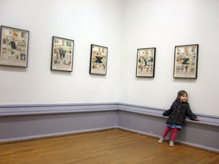
I had the pleasure to attend his exhibition of his alphabet a few years ago, whilst he was there viewing it himself!  His series of work reminds me a little of the alphabet I have been designing, this could be a nice way of collecting some research and representing significant letters such as initials. 


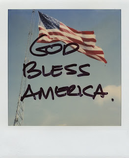
Her work is so poetic and personal, I love how she creates the story behind the photo by documenting her memories, thoughts and feelings. 

I was so inspired by the polaroid effect of her photography that I chose to translate a selection of my photos I took as a primary source for my book cover module 147 DVA Design in Context. 


A very similar style to Eduardo Recife with the use of photo collage, materials and hand drawn text/drawings. I love the tonal range they both use to create that vintage loved feel. 


NAP x


Saturday 23 February 2013

The future is looking bright!

So it was our PDP (personal development planning) lecture this week and we received a very inspiring lecture by our IEMS service (International experience and mobility service), offering a chance for us to travel abroad to work or study. 

I've always loved the idea of working and living abroad in the future, in fact one of the reasons why I chose to come to uni was for the opportunities it can offer me to pursue this. I took a lot from the lecture and questions that were asked, but I choose this weekend to research this a little further and look at my options. I am particularly looking at any opportunities in Australia and this weekend I found a promising possibility to study at Shillington College for 3 months during our summer break. This would give me the chance to see what it would be like to live and study abroad, find new chances for employment, experience a different learning environment, interact with people from different backgrounds, build new relationships and come away with a full certificate in graphic design. 

Photos of the Studios from Google below


I will need to talk to my tutor about this first and the advisor from the IEMS, receiving this advice and feedback from both will determine my decision. I plan to get this started as soon as possible for applying for the full time 3 month course in June of next year until August 2014. I also plan to explore other options to study/work in Australia or anywhere else for that matter as long as it helps me develop me as a designer or person and relates to my work at university.


Earlier in the week I posted a preview of this blog on my instagram feed expressing people to check out the new design. (picture I posted below)


A comment was left on this photo by a blogging community called Glipho (screenshot below), I was so happy and surprised by their response that I decided to look into this world of bloggers. I'm still in the process of setting up an account, as I feel it will broaden my audience and will also give me a new platform to receive feedback of my work and blogging style. After this blog is handed in as part of my PDP module, I plan to continue blogging for myself so this could be a very promising platform for me to work with alongside or instead of this blog.


Once I set up this account I will share a link to it via this blog so watch out for it!

NAP x