This week I have focused my attention to printing in my search of exploring new materials and techniques to broaden my range of work. My five artists this week are print based artists all working with the techniques I hope to learn and improve upon.
Corradetti screen prints his artwork in line form and then occasionally hand paints the infill of colours. The above example with the letter 'KILLER ACID' show the brush marks in the background, this particular artwork has been painted with florescent sign paint that comes to life under a black light.
I have a poster that my papa gave me this year, it was one he kept in his cabin at sea in the 60's/70's that also glows under a black light. I used this as a background pattern in my Enrichment brief to redesign an album cover for The Beatles, it was discussed between myself and my tutor to try to apply this to my design and include in my portfolio as a 3D product. Hopefully soon I will be able to experiment with screen printing designs, paints and techniques from my introduction into the studios at university.
Smith also creates screen printed artwork, however her work is much more simple and dull toned than that of the complex imagery and contrasting colours of Coradetti. The final example shown above shows how her prints have been featured on the front of a book cover, this has encouraged me to try and experiment within this medium before the deadline date is due for my 147 DVA Design in Context brief.
I was recently bought a limited edition screen printed poster promoting the appearance of the band Roots Manuva at Bestival last year. I'm not particularly a fan of their music but this poster definitely caught my eye from the psychedelic imagery depicting a lion. I was lucky enough to attain the 6th edition from a series of 100 prints.
Hodgkiss' artwork is produced by the method of etching into the surface of a steel plate. The imagery of the examples above lead me to think about the characters of the book - The Wind in the Willows and how I could create such work inspired by Hodgkiss. I really like her subtle touches of colour added to a very densely decorated design.
I enjoyed creating etchings so much in my past foundation course at home in Blackpool that I'm excited to take up the art again and begin producing prints perhaps for artwork in my modules or solely for my personal pleasures.
Examples of my prints from the etchings I produced whilst on Foundation are shown here below.
My final major project was based around the idea of Chivalry being Dead in todays current society, I looked at old photos from my family's archive and paired them with dead roses and quotes.
My largest etching I created (below) was roughly the size of A3.
My most treasured print is likely to be this (below) based upon an old photograph of my mother holding my older sister as baby. For clear reasons of its personal hold and the amount of detail I was able to inject into the pattern of my mothers dress, it is also my favourite as it is my first etching I have ever produced.
The pattern is my favourite part of this etching.
The photography I based my etching on.
Above are 3 examples of block prints created by Denning, she hasn't stated whether they are created using linoleum blocks or wooden blocks, both use the same techniques of carving away negative space to reveal an image when printed. I like the rough and sketchy feel it gives to the imagery from the carved lines and texture from the paint, I have never attempted this technique but hope to soon.
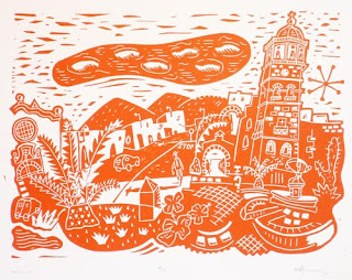
Armson uses linoleum to carve his designs into, I like quite like the rough effect created by the lines built up from carving that have been printed. I also feel that the using only one colour is much more effective and could perhaps be more easy to tackle for my first attemtps.
NAP x


No comments:
Post a Comment