Search This Blog

Monday 26 November 2012

Its beginnng to feel alot like christmas!

 
Yes its that time of year again, the hustle and bustle of busy shoppers, well behaved children and cold, dark winter mornings. Its beginnig to feel alot like christmas already with christmas decorations in the churches and lights around the city.


It was a cold and weather-wise miserable (typical) day in Coventry, I decided to get ahead start with my christmas shopping before the mad decends in early december. Taking a walk throught the back streets of the catherdral were a great inspiration for the traditional christmas I have always loved.
 
* My wrapping masterclass
 
 
* Brown paper, string, patterned brown paper, ribbons and decorations.
 
I consider myself to be very traditional and what a better time of year to embrace all the christmas traditions. Brown paper packages tied up with string is the best place to start, I then injected my creative style to the presents for my loved ones with personal touches for each gift. Layer patterned paper with plain brown paper and decorate with different textures, colours and heighten pieces.


Each gift and card has been decorated with an old black and white photo of that person instead of name tags, this visual personal touch has created a vintage inspired packaging feel and works great for the little ones that can't quite read their name yet.
 
 
Each card has a photo of  the couple/person who the card belongs to, I love how this looks and by adding these little creative elements it shows the amount of effort and care you want to show.
 
* Personal and Creative touches
 
 
Little touches like bundles of twigs, pinecones and double tied ribbon give that festive feeling.
 
 
A hidden Robin amoungst the leaves, berries and twigs.
 
 
Hope this has inspired you to take a creative effort this year with your gifts .
 
Merry Christmas!
 
NAP x


Wednesday 14 November 2012

Home Kitsch Home

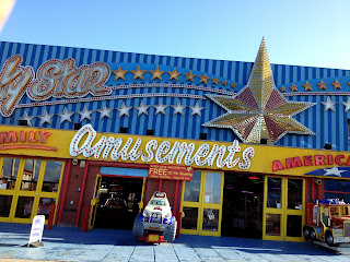
After our leture on Taboo, Bad Taste and Kitsch I decided to go home to Blackpool to see the real tack I have grown up with. From the tourists to rock and kiss me quick hats, Blackpool has to be one of the smallest towns with the biggest jam-packed collection of all Bad taste and kitsch items with the occasional taboo of its reputation and resisdents lifestyles.
 
At the time I was there the season had just finished so no illuminations were light up and hardly any tourists were about however arcades and souvenir shops were still open and busy.


From missing home and my family alot these last weeks, I almost became a tourist myself from trying to experience Blackpool in such a short amount of time before I left again. A quote that pretty much summed up my time home below, despite all the tack and kitsch its still home to me. 
 
(sorry for the bad quality but its such a good image)
 
 
Now being a sandgrown lass from Blackpool, heres my idea of Kitsch and Bad Taste.


The most tackiest thing you will see in Blackpool has to be the Stag and Hen parties, they are everywhere in summer and never seem to change no matter how orignial they believe they are being.


NAP x
 

Thursday 1 November 2012

Projects

 
Ready to hand in my portfolio tomorrow for the past 5 projects we've been set thought I would share my work here and research to go along. I've even added some of my contextuals websites for you (how kind) enjoy!
 
Brief 1 - The Necklace
 
Task given was to take a photo to illustrate the short story The Necklace by Guy de Maupasssant.
 
 
Mario Testino - Photographer I was inspired by for my photoshoot

My final page spread

 
Brief 2 - Film Poster
 
This given brief restricted us to only using hand rendered typography.
I choose Edward Scissothands as it is one of my favourite films (helped by the actor Johnny Depp). 


My Final Poster Design
 
 
Craig Ward - A very inspirational typographer
 
Brief 3 - Billboard Poster
 
Task - To redesign a newpaper ad in the form of a billboard ad. I choose the personalised model replica of a Lambretta Scooter as I love the 60's era of MOD's and Rocker's.
 
 
My research sheets

 
My First Billboard ad inspired by MOD's.

My Final Billboar ad inspired by the Psychedlic 60's and the illustrator Alberto Seveso.


Brief 4 - Logo's
 
Redesign the Argos logo for their new launch of stores in China.

 
My Final Logo designs

Brief 5 - Manifesto
 
Our final project was to create our very own manifesto to describe our work and myself as a designer.

 
Development of my ideas

 
3 Designs

 
My final Manifesto
 
I chose the very fitted 3 word phrase of 'Just wing it' a clever take on the Nike slogan -  Just do it!
It also sums up my attitude to life and work in certain situations, the image in the centre is of an eye of god nebula to represent my faith and ambition.
 
 
NAP x